I stumbled upon the Google Sheets document with more than 700 companies hiring remote workers and opened every link searching for a job. In this blog post, you can read my observations and suggestions about the Careers page and job listings.
Careers page
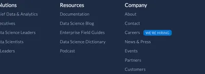
When I look for a job, I prefer to find a link to the Careers page in the main navigation or the footer. Don’t put it in the dropdown, so I cannot see it highlighted when I use the CMD + F to search for it. I don’t want to waste time inspecting the source code to find the link. If you cannot put it in the main navigation for whatever reason, just drop it in the footer. Actually, I prefer the footer over the main navigation, especially if it is listed under the “About” or “Company” section.
Another thing that bothers me is the untypical wording. Use usual words like Careers, Jobs, Hiring, or Join us. Why use the term vacancies? Or “Become a [insert a made-up name for company employees]”? No, don’t get smart with me on that, or you might miss my application.
If you ask me, everyone should use the word “careers”. There are some non-English sites in this exhausting list, and I managed to find the Careers page on them. Do you know why? Because the word “careers” sounds similar in most languages. Germans say “karriere,” French “carrières,” Spaniards “carreras,” Polish “kariery,” and even Turks say “kariyer.” I could have translated the page, but who has time for that?
So, what happens when there is no Careers link on the homepage? Well, then you put your detective glasses on and start digging. Start with the About us page. Sometimes you can find the link there. If not, try the Company page. Didn’t find the link? Search for the Contact page. Still no luck? Then you have only one chance - the Team page. This is where I usually give up. When I spend more than two minutes trying to find the Careers page, I’m out.
Back to the Careers link. Did you ever see that little thing, that label, saying “We’re hiring” (or something that simple) next to the Careers link? That’s my favorite. Especially if it is accurate and the company actually has open job positions.

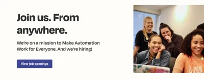
Now I’m on the Careers page. The first thing I want to see is open positions. Common practice are you see a button saying ”See open positions” or something similar at the top of the page, and when you click the button, one of the two things usually happens:
- the page gets scrolled to the part where you see open positions, or
- another page is opened in a new tab (usually a website specialized for hiring with a list of positions).

I prefer the first option. I don’t even mind if you embed the list of positions on the Careers page. Just show me the list as soon as possible. And another option is fine. It is acceptable to me to have another browser tab. I am not that nitpicky.
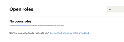
Finally, you should see some open positions. But our world is far from ideal, so you might not see the links. Instead, you may find a statement that says there are no positions at the moment. That is all good only if that little label saying “We’re hiring” is not there. If it is, you just made me say some naughty words.

Sometimes instead of a statement, there is a form to get either notified about or apply for future roles. I don’t know if filling out the last one works, but I hope it does. Also, it would be great to see the list of all roles the company might need in the future. Or at least list some expired or filled positions just to make it more clear what type of positions are in need with this company.
If you are not hiring, I have a few suggestions for you:
- lose the “We’re hiring” label,
- disable the “See open positions” button,
- if you’re accepting open applications, replace the “See open positions” button with the “Apply for future roles” button, and
- add a paragraph saying ”We’re not hiring” as higher as possible on the Careers page.
Regarding other information on the Careers page, like the company mission, values, and culture, these are only important information if I find the open position first. So, show me the available positions first, then display all the other information.
Job listing
What does the perfect position listing look like? First, make sure the link is valid, and second, ensure the job hasn’t expired. I’ve found a few expired and/or broken links and job posts over a year old. If you have an ongoing need for some position, make it say so, and leave the date out. Next, the title of the role should be specific. Bonus points if the leading technology is mentioned. Don’t forget to add location and, more importantly, clarify if it is a remote-friendly position. And don’t write remote, and then make it remote only in a specific country. List that country. Ultimately, add salary range, if possible. I love to see the expected salary for the position.
Here’s what I imagine the perfect job link looks like:
Frontend developer (React) - 100% (Worldwide)
$80 000 - 100 000
I don’t think that is too demanding. Yet, I didn’t see this kind of job listing on more than ten websites.
I have just one final thing: the confirmation email. It is lovely to get the email saying the application was successful. If that email mentiones the usual period for replying, that is even lovelier.
So there you have it, these are the things I noticed while searching for a job and browsing more than 700 sites. Happy hunt, seekers!