Recently I've been writing about CSS tabs. Topic was surprisingly popular, gaining several thousand users to my page.
What was even more surprising were comments about accessibility. Although my initial idea was to present just a CSS technique for tabs, I decided to investigate a little bit more and add accessibility to my solution.
Existing solutions
CSS tabs are very old topic apparently, I've even found an article dating back in 2003. And it is a very popular topic, too, search results returned dozens of articles. I decided to document every article in a Github repository (which is no longer available).
If you have an article that is not in the list, please add it by making a pull request.
Accessibility
Reading all this articles made me realize that accessibility is a major issue nowadays. And accessibility is hard. But that doesn't mean that we should ignore it. Quite the contrary, we should learn it and apply it.
WAVE
We need to find a tool to test our tabs for accessibility. Web Accessibility Initiative provides us with the list of tools here. I prefer WAVE, web accessibility evaluation tool, because it is available from Firefox Web Developer Toolbar, under section Tools > "Validate Accessibility".
ngrok
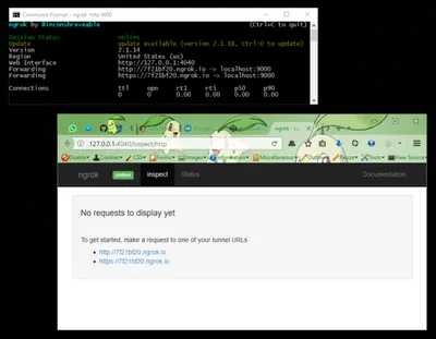
Since I was developing locally, WAVE couldn't access my localhost. I found solution in ngrok, a tool that makes tunnels for localhost. To create a tunnel for your localhost, download ngrok executable file, place it in project root, open Command Prompt and start it using ngrok http 9000 command. Last number is the port number of your application which is 9000 in my case. Then open 127.0.0.1:4040 page, copy tunnel URL and paste it in WAVE application. Here's how it looks in action (and yes, that's Pokemon theme for Firefox):

Contrast
WAVE detected a couple of contrast errors. That's the easy part. We should use stronger colors for text and lighter colors for background. Visually impaired people shouldn't have problems with reading tabs labels and content now. And there's no errors from WAVE, too.
aria attributes
Our tabs are not yet accessible. To make it accessible for every user, device and tool, we should add aria attributes. aria attributes are used to add context for elements. That way tools and devices are able to read the content and reproduce it in a way that every user could understand it.
Screen readers
We should test our tabs in some of the assistive technology tools, because results could help us start adding accessibility. I decided to use Jaws and NVDA, both available for free on Windows platform. First thing I noticed, after running these tools, was that HTML structure is not suitable for accessibility. We need to add div wrappers for tab labels and tab content.
aria roles
Now we could add aria attributes. There are specific aria roles for tabs:
- tablist,
- tab and
- tabpanel.
Every role could have required and optional attributes. Required attributes are easy, because we know we should add it to an element. Optional attributes are problem: how can we know which ones work and which ones don't? Ideally, every attribute should work. But as I discovered, they don't.
Trial and error
Because there are so many tools and devices and documentation is overwhelming, I decided to use trial and error method this time. After few hours, I came up with final solution. You could see it in this pen:
Radio buttons
In previous article, radio inputs were hidden. I decided to use them as a part of design for tabs. Most users should be familiar with radio buttons, as they are widely used on the web.
To position every radio input, we could use absolute position with top and left offsets. Tricky part was to make it responsive. nth-of-type selector is used to adjust position for every radio button.
Interaction
To add some interaction, we should add a little bit of JavaScript. It is mostly used for changing states, like aria-activedescendant, aria-selected and aria-expanded. HTML and CSS are still used for handling tabs.
Navigation
Now that radio buttons are visible, user could navigate through tab labels more intuitively using left and right arrow keys.
Also, we should add trigger to help users jump to content from tabs. If a user press "Enter" while on the tab label, matching tab content will be focused.
Final thought
Accessibility is hard to implement, but non accessible content is even harder to interpret for impaired users. We should try our best and make our content accessible.
But on the other hand, if you're making a solution for targeted audience and there are no special request for accessibility, aria attributes may not be necessary. They are hard to implement and very time consuming.