A CSS style guide is a set of standards and rules on how to use and write CSS code. It often contains global branding definitions like colors and typography and a set of reusable components for building a more consistent and maintainable project.
CSS style guides should be considered an equal citizen of every project requirement.
There is more than one definition of what the style guide is. For example, Wikipedia says:
“A style guide (or manual of style) is a set of standards for the writing and design of documents, either for general use or for a specific publication, organization, or field. (…)
A style guide establishes and enforces style to improve communication. To do that, it ensures consistency within a document and across multiple documents and enforces best practice in usage and in language composition, visual composition, orthography and typography.”
CSS Guidelines site/Harry Roberts says:
“(CSS styleguide should contain) High-level advice and guidelines for writing sane, manageable, scalable CSS.”
Google HTML/CSS Style Guide says:
“This document defines formatting and style rules for HTML and CSS. It aims at improving collaboration, code quality, and enabling supporting infrastructure.”
All of these definitions are telling us the primary mission of the style guide: to help each other understand how to read, write and use the code. It is vital to know that every style guide is unique and its definitions, principles, and structure should be a team effort, rather than a persuasive way to follow someone’s logic or idea.
Here are five things that you should keep in mind when working with CSS style guides.
Define coding format
Every style guide has a set of rules that should help every person on the project write the code in the same manner. By following these rules, developers could avoid typical problems in every-day tasks, like merge conflicts and linting errors. Your team could agree on indentation preference to spaces or tabs early in the project. Other common rules are tab width, adding new lines at the end of the document, and usage of quotation signs.
For example, WordPress Style Guide defines the structure for writing CSS declarations:
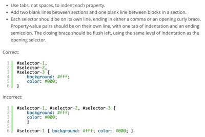
There are tools like Prettier or editorconfig that could help your team produce well-formatted code. Make sure you include the configuration file in the project. In addition, you might want to add a note in the README file about how to set up the code formatting in different code editors.
Agree on the naming convention
There are many different naming conventions for CSS. The most popular ones are BEM, SMACSS, and OOCSS, to name just a few. If your team decides to adapt to the naming convention, every developer should understand the structure of the component. The code would feel like it is written by a single person, which would improve readability. Additionally, isolating CSS naming convention from JS naming convention is always a good idea.
For example, Lonely Planet uses BEM as a naming convention:
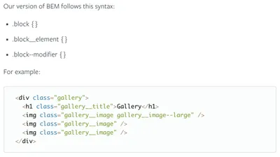
“Naming things is hard but worth getting right. To make it somewhat simpler we use the BEM methodology within class names. BEM also helps us to avoid cross module collisions and to signify intent and relationships from the classnames.”
Not every developer would agree about the naming convention, but as long as every developer follows it, that is all that matters. That is one of the reasons why style guides shouldn’t be the responsibility of a single developer, but a collaborative effort made with every developer in mind. It wouldn’t hurt to put a note about the naming convention decision somewhere like in the README file.
I prefer using BEM on almost every project. I am also familiar with other naming conventions. It is with worth familiarizing yourself with all of the naming conventions as that can be helpful primarily if you work on multiple projects or with multiple teams.
Define coding rules
Coding rules should include decisions about defining global styles, variables, mixins, functions and more. These coding rules could be about anything, from typography to unit usage.
For example, Lonely Planet defines typography usage. The team decided that style collisions across projects could be avoided by not establishing typography globally, but by applying a particular class to a wrapper element. I could only guess, but I assume the team made this decision after they noticed the problem, then discussed it and finally come with an agreement. I might disagree about this issue, but if I were a part of the team, I would understand where they were coming from.

Once the team agrees on every rule, you should stick to it. No further discussion on this subject is needed. That could save your team so much time. It should also prevent possible disagreements and arguments between team members, too.
For example, Primer defines four major breakpoints. By identifying these breakpoints, the creative team could design pages and components within these limitations, and the development team could style those pages and elements more easily without further guessing or discussing the breakpoints.
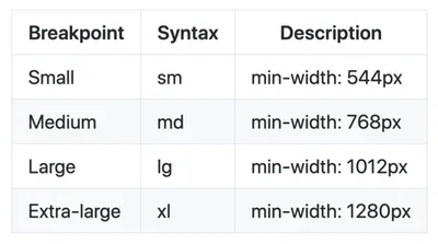
I prefer to define colors, typography, and breakpoints as global variables. That helps me build a brand that is more consistent, recognizable and discoverable.
Define reusable components (if they are a part of your style guide)
Some style guides include reusable components, and some don’t. It doesn’t matter what you keep in your style guide, as long as it helps the team to build a better, maintainable product.
When components are part of the style guide, you should take into consideration some of the following questions:
- How would the component behave if you place it in the different part of the site/app?
- How would the component behave if you put it inside another element?
- Could you break the component into smaller reusable items?
Style guide components should always be isolated particles of the product. By resolving this criterion, you could maintain, update or even replace the component more efficiently.
For example, Primer defines a popover component. The content of the popover bubble could be another component, like a button. If the primary button changes, it would be updated across every component, including the popover.
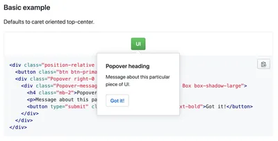
A good practice is to add variations to your components. You should isolate variations, too. If you need an element that has a different text size and alignment, then consider using two separate variation classes for this particular component.
When the same variations appear on more than one component, then you could consider adding utility class. Utility classes often solve problems like alignment, paddings, and margins.
For example, Primer defines utility classes for padding. A popover component uses a utility class to achieve consistent spacing with other components.
I don’t prefer adding utility classes to a project, but if you could justify the decision of adding them, go for it.
Consider using a tool for a style guide
Some tools, like KSS or mdcss or Stylemark or Nucleus, could help you generate style guide right from the code. All of these tools work on the same principle, a documenting syntax, that would parse comments from your code and compile it as static pages.
Some tools, like Stylemark and mdcss, support Markdown syntax, which could be useful if you are familiar with it.
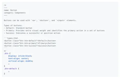
As a global rule, besides providing examples, it is advisable to write the purpose of the component, how to use it, and which modifiers could be applied.
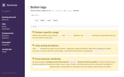
If you don’t prefer generating a style guide automatically, you could create it manually. Any method would work, as long as it does not take too much time.
I prefer using KSS and Stylemark because I could set up and configure a new style guide within minutes. I haven’t stumbled upon any problems so far. I find these tools have all requirements to create a robust, and easy to use documents.
Conclusion
Each style guide has or should have the same goals — to improve consistency and usability. By standardizing your code, and by applying uniform design principles, you could create a unique cookbook with “dos and don’ts” that could help your team build the product more efficiently and consistently.